The perimeter of the university wall along Katipunan Avenue from the gate on Shuster Street to the one on Magsaysay Avenue – all 430 meters of it – is the Freedom Wall. This long stretch of wall has been a canvas by often anonymous makers for their graffiti and street art sprayed in vibrant colors and dynamic forms.
Last September, a portion of the Freedom Wall was used for a graffiti competition called “Wild Walls.” According to their Facebook page, the goal of the event is “to showcase individual techniques and styles” but more importantly, “to cultivate homegrown talents and promote the continually growing graffiti community in the Philippines.” After their open call last August, eight Filipino graffiti artists were picked to participate in the elimination round where they created their own piece after a word prompt. In graffiti terms, a piece (short form for “masterpiece”) is a mural of letters that can take several hours and spray cans to complete. Criteria for judging included creativity, style, colors, technique, as well as tags and throw-ups, both of which are drawn in quick gestures. Tag in graffiti is the most basic form done in one color, while throw-up or throwie is in bubble letters in two colors.
In this interpretative assignment, photos containing four graffiti pieces were provided to the class as well as their location. I was able to piece out the context as to why they were made using the throwie “Wild Walls” as the starting clue. If not for a post on their Facebook page, I will not be able to read the pieces, which I discovered were referring only to one word.
And it is actually the intention of this graffiti style that the participants used called “wild style.” According to Cedar Lewisohn in his book Street Art: The Graffiti Revolution, wild style is a “complex typographical form of [graffiti] lettering, intended to be indecipherable and alien to the general public.” In a 1997 article by Josephine Noah in graffiti.org, she described wild letters as a “mental and artistic challenge [for] both the writer and a reader” which have “subversive implications because it can only be read by few.” In Lewisohn’s interview with graffiti photographer and videographer Henry Chalfant, Chalfant shared the significance of how the form developed through “trains, on a moving object that helped give it its kinetic energy.” In the Wild Walls competition, the inherent dynamism of wild style is externalized in the prompt: the word “GAME.”
Among the four pieces, I will attempt to interpret the graffiti created by WIPZ and the Wild Walls winner, RESTOK.
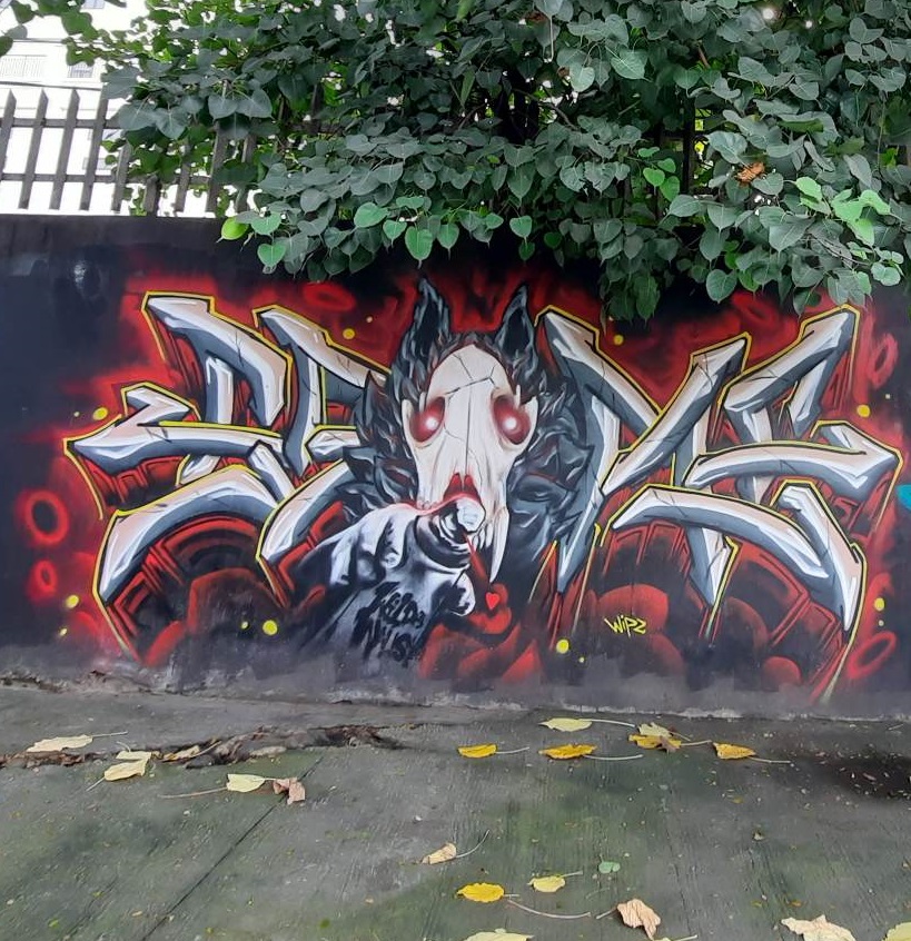
In WIPZ’s haunting take on the prompt, central to the piece is a skull of a monster outlined with thick gray fur, red glare shining out from its hollow eye sockets, the letters G-A at the left and M-E at the right sticking out like boney arrow-head appendages. The letters are thinly outlined in yellow which provides a bright contrast to the morbid palette. Blood red is used to emboss the letters for dimension and also to surround them like a sinister mist. Jutting out from the last stroke of the A is a fleshy hand, not bony, gently pressing the nozzle of a white spray can labeled with the event throwie. What came out from the can is a short, thin red line, then oddly – considering the overall bleakness – is a tiny heart, drawn in its usual shape, not anatomical. All elements considered, WIPZ’s “game” can be interpreted as the game of life and death. As signified by the spray paint, such is the game that a graffiti artist participates in. Outside of the graffiti battle, these artists usually work in the dark in terms of time and location, since it is usually seen as vandalism by the community or authorities. Connecting it to the little heart could implicate multiple things: that WIPZ as a graffiti artist is simply doing what he does because they love the art, or that there is always love in the pieces that they make, no matter how small it is. In a less optimistic view, the heart coming out of the can could also mean that the last dregs of love have already been squeezed out by the monster, that there is nothing left. However, I am assuming a more positive perspective because of another element: the yellow outline on the letters as the “silver” lining within the overwhelming darkness.
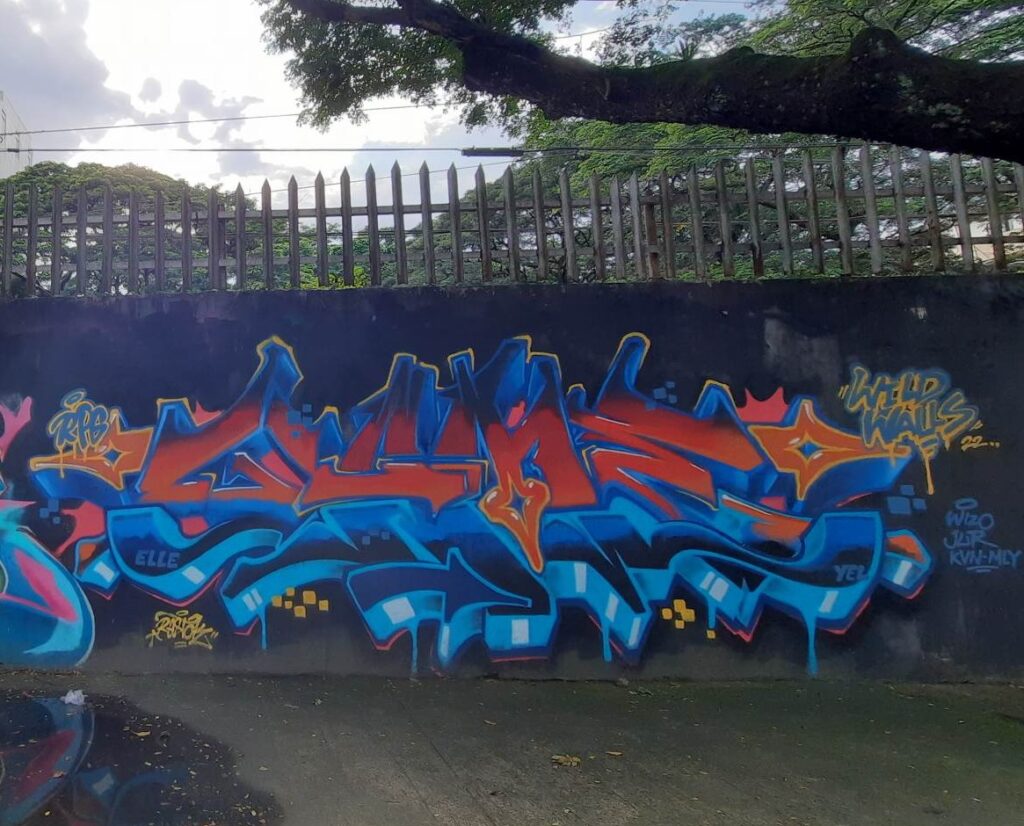
Moving to RESTOK, his piece immediately shows the balance created out of the contrasts within form and color. Across the median of the letters is an invisible divider. In terms of color, the upper half is colored in a gradient of fiery orange, while the bottom half is of icy blue. Black is incorporated into both gradients, particularly at the cap height (uppermost) and baseline (lowermost) areas of the letters. Focusing on the form, the strokes in the top part including the crossbars of G, A, and E are more diagonal and linear compared to the curvaceous strokes in the bottom half. Aside from the letters, another prominent feature in the piece is the three orange arrows jutting out to the left from the leftmost part of G, downwards from the crotch of M, and right from the rightmost part of the first arm of E. In addition are minor details such as groups of small blue squares and yellow squares and a peach splatter behind the letters: slightly visible on the top half, the peach further accentuating the orange, but only appearing as an outline on some parts on the lower half, the peach complementing the blue.
Aside from the “Wild Walls” throw-up and his artist signature, RESTOK also wrote “RPG” (featuring a halo between R and P) as a throw-up that perched on the leftmost arrow. Tags that read “Elle,” “Yel,” and “Wizo Jur Kvn-Mly” are also scattered around the piece. The RPG with the halo can be a clue on the artist’s representation of “game,” since the acronym commonly connotes “role-playing game.” In RPGs, you can usually choose or modify your player character: their attributes, background, personality, traits, and so on. The balance from the contrasting forms and colors of the piece could pertain to the aspect of constructing a base player in an RPG where you have to balance attributes to start with a standard character, neither under nor overpowered. The prominence of the arrows, which are elements traditionally integrated into wild letters, is also relevant to the RPG concept as they usually indicate the directions in which a character could or should go. The small squares can be related to the usual square tiles in RPGs that form the basic blocks of the visible terrain, which can be further associated with the square pixels that are the actual building blocks of computer or printed graphics.
The Wild Walls competition indeed captured the individuality of different Filipino graffiti artists with how they approached the word prompt. “The whole meaning of the art is that it’s a communication language,” graffiti artist Vulcan shared in Ivor Miller’s Guerilla Artists of New York City. “My main thing is taking letters and distorting them, changing them, mutating them. It’s about evolving the alphabet. Just because somebody said this is the way it’s supposed to be, it doesn’t mean it has to be; you can individualise the alphabet. You can make it your own.”
For WIPZ and RESTOK, they truly made “GAME” their own.
This was written for Art Criticism (Art Stud 255) course in UP Diliman, 1st Semester AY 22-23.
Leave a Reply